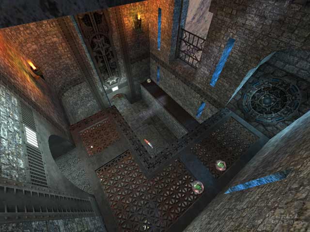
mIKE's quick creation features a strong vertical element. The connectivity is lacking in the horizontal direction, but the particular structure of the arena enables the weapons in the map to remain useful. The texturing is okay for the castle theme but does not blend well. The architecture, while simple, features windows to help develop the atmosphere; however, the hallways in the lower areas are generally cramped and inhibit the game flow. The items are distributed okay, but there simply is not enough map to house the necessary items for a quality two person game, including preferably at least four weapons and two defensive items (armors and MegaHealth). The bots do okay but ignore parts of the map so that they are extremely predictable in some ways.
This map is a good start, but there is not enough work in the horizontal direction.
Reviewed by Pure Imaginary
Second Opinon
This map was made for a contest where the contestants had to keep the map within a 1024x1024x1024 area. To put that in perspective, the map had have a footprint about half the size of Q3DM1. As a design exercise, it succeeds pretty well. It looks good with some help from the Dismal Solace texture set by Evil Lair. Items are sparse, but in-line with a map this small. Bots played fine, but predictable.
It's hard to get good game play out of a map this small, and I'm sorry to say that this one has some serious problems. Once a player camps on the top level, there's not much anyone can do. The only ways up are jump pads, and both landing areas are easily guarded. The yellow armor, Shot Gun and +50 health are also in easy reach. This map would benefit greatly from just one more connection to the top level
Like so many concept or contest maps, it's an interesting design exercise, but I found this map to be not so fun to play.
Reviewed by GrendelSprite.
Ranked: 4.1 out of 5 (10 votes)
Download: 1024_vs_me by mIKE
