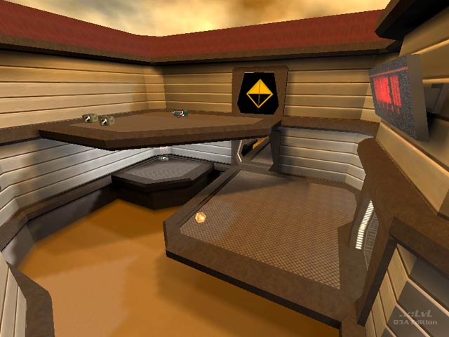
outta world arena
outta world arena by Chris.
Comments
Add a comment
avatar
**Preview only**
Be sure to submit your comment
Formatting help
Submit
Preview
Cancel
Submitting comment...
avatar
gooball Rep. 1161
#6   03 Jun 2011
sweet map, btw, is not about score, is about effort
Agree (0) or Disagree (0)
SW12 unregistered
#5   10 Dec 2010
What ever happened to Chris? This map Is like your ordinary Run-of-the-mill map. Like what mappers are doing now. Like Solitude by hipshot, Lost at sea or Gothic Dawn.

Those maps had themes like this one, but were very ordinary in the form that they are vertical, and unreal-like battlefields like The original Q3 maps themselves. I am looking for something like an experimental or singleplayer feel/gameplay.

Or some battle taking place in an exotic place. Take Space Arena for example. Or Hogwarts. The only nitpick for this map was that the fog of death pits should be deeper. I think with the doors being black is that he just wanted to make them look pure, and glossy.

Agree (0) or Disagree (0)
chris unregistered
#4   01 Feb 2001
it's a long and a hard work,

for using good textures and

strutures, sorry for the lack

of a RL, i will send another

version with RL and quad.

i can see my poor score !!!

Agree (0) or Disagree (0)
Tetzlaff unregistered
#3   01 Feb 2001
Chris isnĀ“t the only mapper who makes wrong use of that black shader texture for the doors. I even remember that Drunken Boxer used that in Crossed Paths CTF...it really looks wrong.
Agree (1) or Disagree (0)
Deathmonger unregistered
#2   01 Feb 2001
/me replies macho

The texture chris has used for the doors is actually the texture used for the TRUE door texture as shader effect!!!.

Score 4 out of 10

Agree (0) or Disagree (0)
macho unregistered
#1   31 Jan 2001
simple, but very well made level.

But I think that GL should be replaced with RL and the door texture probably has no shader?

I give it 7/10

Agree (0) or Disagree (0)
Clear