Added 31 Oct, 2015
Comments
Add a comment
**Preview only**
Be sure to submit your comment
Be sure to submit your comment
Submitting comment...
Good job the Shib.
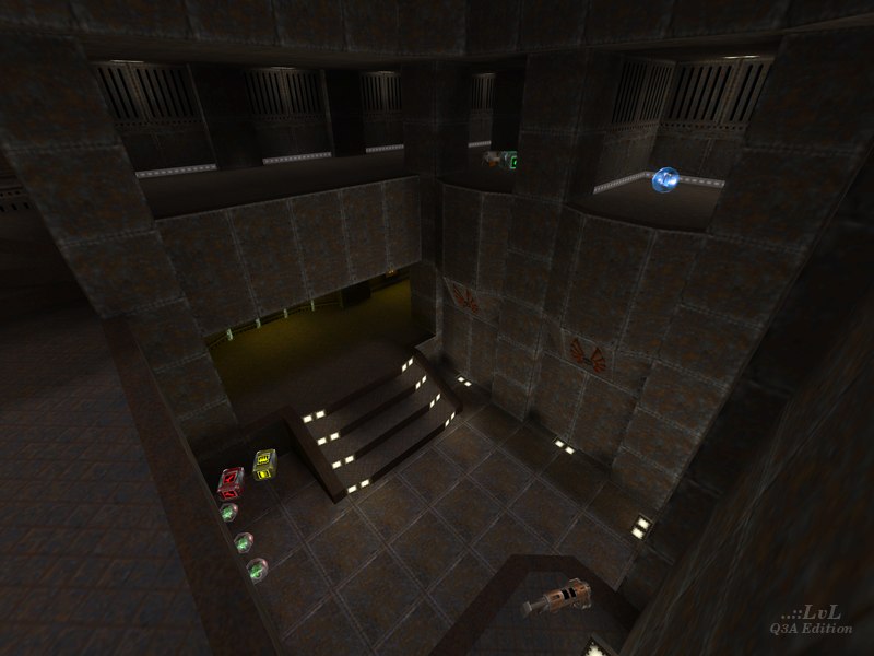
It's always interesting to see someone else take on a map you've done yourself. (Thanks Tig, for the tip and link to my version btw). The scale on this one feels slightly smaller than mine. This is most evident on the lower ground where you can hop to the lower platforms where the RL and SG (below the RG) are without the use of the stairs. And also up onto the RG ledge from the SG level. Whilst trying to maintain the vertical scale on mine I tried to improve flow by adding small ledges to allow the player to achieve the same result of this version, so it's horses for courses I guess. A few other noticeable differences:-
- Coming from the upper MH area down the back stairs this map maintains the height of the original ceiling. Which you can easily hit your head on. On mine I made the decision to ease that a little.
- The red armour area maintains it's lack of visibility from the ledge above the RL. Mine opens up the RA area making it more of a risk to take.
- The lips to the MH here are less than mine. I was thinking about flow when I made the decision to increase mine and make the MH easier to take. But this map is more in keeping with the original.
- I went for stairs that look like a ladder on my map and this one uses a lift. Neither is perfect. but I feel mine replicates the play-style there better.
- The item layout on this map stays truer to the original than mine (though not by much). I tried to encourage the gameplay to use areas that wouldn't normally see as much action by switching up the item layout ever so slightly, with a lot of feedback from players and testers at the time.
Ian
AKA FoRa
Agree (0) or Disagree (0)
