Be sure to submit your comment
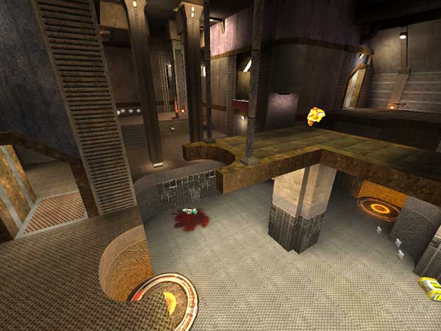
Item placement could maybe use a few tweaks. The YA shown in the screen shot could probably have been a RA. The second YA could have been done away with. I feel like that might have made the main area a more contested point for control. Aside from this, texture choices were a little hit and miss. Also on the negative, Lighting is a very spartan affair. Its there, you can see. Which of course is the point of putting in lights... but an atmospheric showcase they are not.
So the place is a little run down, but like they say on all of those home renovation shows... "this house has good bones". Despite my nitpicks its a fun map and I think I'll keep it.
If I want connectivity, I'll call Verizon Wireless. In this day and age of DDR, AGP 8X and hypertransport buses, connectivity just doesn't fly off the deck as much as dried-up bird-turd. The bots enjoy themselves? At what?! An orgy? A glass of wine? Decent game? What the (expletive)?! Oh, like, they're suppose to give you excellent or lame ones? This reminds me of unfinished condo concrete foundations. 3/10."
Utterly. Incoherent. Crap.
Constantin: are you still here? wow, it's no wonder you can't find a man? and IF you did, you'd annoy the living f*ck out of the poor bastard.
"I'm not here to please anyone. I'm here to voice my personal opinion on the map."
Seems more like "I'm here to show my utter boredom and type some random crap with no relevance to the subject at hand while making a total idiot out of myself." to me.
"unlike some of the other twats on this site" Oh how come you're still here then? Maybe it's just because all you can do is bitch and whine about other people's effort ( be it mapping or writing a review ) without contributing anything to the community?
Perhaps you should get back to your CS or UT or whatever pals where this sort of ignorance is welcomed. "Viper-dude", may ass...
Is it cold in here or is it me?
Scampie-bambie should spend more time outside getting some fresh air, chasing girls than sitting his buttocks endlessly playing first person shooters. Uh...by the way, in computer years, Quake III is so, like, yesterday.
Scampie gave it 7/10 and I accept his verdict. And Viper-dude seemed to have enjoyed and posted a review. Great! I still think it looks like semi-finished masonry and to me the map is mundane compared to others. I'm not here to please anyone. I'm here to voice my personal opinion on the map. I never insulted the mapper and if candy-ass Scampie can't take the heat he should find something else to do. All in all, how maps look and feel is all very subjective. One man's trash may be another's treasure. There is no set defined standard on this. Even the webmasters of this site don't even have some sort of system established to rate them. So, see Scampie, it's all one's subjective point of view on the map at hand and not a personal attack on the individual or his talent. If what's-his-face reworks this map-but Doom III will be out and all you geeks will drop Quake III like a hot potato-and recodes it, I'm sure he'll come out with something improved from his first creation.
Goodnight Scampie and stop thinking about dickheads. That's not healthy for a boy your age.
If you have nothing to contribute of use, please reframe from being a raging dickhead.
noname: This is an excellant little map with a great layout and a good theme which is just slightly underdeveloped. The architecture isn't perfect, but a bit more work in future maps should remedy this. Keep it up.
Would give it 7/10 normally, giving it a 10/10 to offset the previous poster's rating.
If I want connectivity, I'll call Verizon Wireless. In this day and age of DDR, AGP 8X and hypertransport buses, connectivity just doesn't fly off the deck as much as dried-up bird-turd. The bots enjoy themselves? At what?! An orgy? A glass of wine? Decent game? What the (expletive)?! Oh, like, they're suppose to give you excellent or lame ones? This reminds me of unfinished condo concrete foundations. 3/10.
Also, noname did pretty well with the looks considering he stuck with the base id textures.
